The House of European History museum takes a big stride into 2024 by revealing a new distinct and vibrant visual identity, which portrays the colourful multi-perspectivity of Europe's past.

As the only museum in the world dedicated to narrating the complexity of the European continent under one roof, the museum’s new look and feel is engaging and eye-catching, contrasting, vibrant and sometimes pensive to reflect the museum’s exhibitions and content.
Since 2021 the team worked closely with the Concept and Design unit of the European Parliament, market research agency, Kantar and creative agencies, Ogilvy and NewDesign (previously SuperUnion) to explore audience perceptions and brand positioning, while aligning on the museum’s strategic goals, messaging for the future, mission and vision, to create this fresh new look complete with a new logo, tagline, colour palette, living timeline and typeface.
These elements come together to show our audience that history's moments are colourful, powerful, and exist in a living timeline which can be engaged with at any point, and highlights the relevance of European history to the real-time events we experience today.
Elements of the new brand
Speaking on the rebrand, Museum Director Constanze Itzel shares: "When we first opened our doors in 2017, the aim was to create a museum that would display the multi-perspectivity of Europe's recent history. Today we want to continue on our journey with a fresh outlook and new branding – these colours remind us that history is not black and white, it is colourful and striking, it is also contrasting and complementary."
She adds "Much like the museum, this new visual identity is engaging, inclusive and interactive while also pensive and purposeful. Our new branding is a reflection of who we are and a reminder to our audience how the House of European History is a place for everyone."
Logo
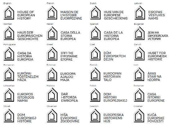
One of the core elements of the rebrand, was the introduction of a new logo. As the primary building block in establishing visual recognition of the museum, it reflects the core personality and values of the museum - to connect Europeans to their shared memory.
The overall structure of the logo embodies the museum, where collections of our shared European memories are housed together in one place. Three lines are used throughout the structure, which symbolise Europe’s past, present and future.
The combination of dark and thinner lines represent our understanding of history, from a national and transnational approach, but the gaps are a reminder that history itself is incomplete.
Finally, the three lines at the bottom of the logo represent the steps of the building in the House of European History.
These steps invite our visitors inside and remind them that together we move forward and into Europe’s future.

Tagline
To communicate clearly and effectively, in a simple and concise way of who we are and what we do, the House of European History devised a short tagline - ‘’A shared past in one museum.’’
This tagline, which has been translated into all 24 official languages of the European Union, was carefully selected and tested, to ensure our audience understood what the museum is about while reminding people that as Europeans, we do have a shared continent and a shared past with different experiences of the same events.
Colour Palette
The House of European History aims to inspire and uncover emotions that broaden people's perspectives about Europe's past. The colour palette reflects this with a variety of colours designed to evoke different emotions.
However the colours are also a reminder that history is not black and white. It is colourful, dynamic and contrasting and the primary colour palette reflect the different perspectives that co-exist in parallel.
The pantones provide enough variety to design striking creative assets, paired with a set of clear application rules for consistency, and to ensure ease of accessibility with our audience.

Living timeline
The application of our colourful living timeline aims to show history's moments, not in a cold, sterile and distant way, but as a living, breathing almost portal-like visual aid that can be engaged with at any point, by bringing the relationship between the events and players to life.
It is created by the layering of imagery from historical events and objects to remind us that we are connected through history. Our role as a museum is to help our audience and visitors connect these wider European memories and broaden perspectives.
Typeface
Finally the House of European History has adopted the custom made typeface of the European Parliament - Europea. It was created to embody the values of democracy, inclusivity, and progress.
The geometric shapes in the typeface represent the accessible, inclusive and connective nature of the European Parliament, while the humanist elements add a touch of warmth, elegance and approachability. The relaxed proportions based on the circle bring a sense of harmony and balance to the typeface.

